How to build a smarter WordPress growth dashboard


Most WordPress dashboards look busy long before they become useful.
You log into Analytics, Search Console, your hosting panel, and maybe WooCommerce, then end up with a pile of numbers that don’t tell a clear story. Traffic goes up, but revenue stays flat. Sales improve, but you are not sure which pages or channels helped. Returning visitors rise, yet you still cannot tell whether loyalty is actually improving.
A better dashboard fixes that problem. Not by tracking everything, but by surfacing the few numbers that connect traffic, loyalty, and revenue well enough to guide your next move.
If you want a simple place to start, build your dashboard around one question: Is my website attracting the right people, giving them a reason to come back, and turning that attention into business value?
That question is broad enough for a blog, a service business, or an online store. It also keeps you from chasing vanity metrics that look impressive in a report and do very little for your business.
Why most dashboards stop short
Many site owners still treat traffic as the main score.
Traffic matters, of course. You need people to find your site before anything else can happen. But a dashboard that stops at sessions and pageviews leaves out the part that matters most: whether those visitors are becoming loyal readers, qualified leads, or paying customers.

A useful dashboard needs a chain of logic. You want to see how people arrive, what they do next, whether they return, and whether the site creates measurable value.
That is why a smaller dashboard often works better than a larger one. When every chart fights for attention, the important signals disappear.
Start with one traffic metric, one loyalty metric, and one revenue metric
You do not need ten charts per category.
For most WordPress sites, one clean metric from each area will give you a better read than an overloaded reporting screen. Add a few supporting numbers around those core metrics, and you will have something you can actually use each week.
Here is a practical setup.
1. Qualified traffic
Start with total users or sessions, but do not stop there.
Add one quality check next to that number. For a content site, that might be the number of engaged sessions or average engagement time. For a lead-generation site, it could be visits to service pages or contact pages. In a store, it may be product-page sessions or add-to-cart sessions.
The point is simple: traffic should have context. A jump in visits means more when visitors also reach the pages that matter.
If you are still trying to judge whether your raw traffic numbers look healthy, our guide to website traffic benchmarks can help you set realistic expectations.
2. Traffic source mix
Next, track where your best visitors come from.
Organic search, direct traffic, email, referral traffic, and social traffic each tell you something different. Organic often reflects your search visibility. Email typically reflects audience loyalty. Referral and social traffic can reveal whether partnerships or campaigns are doing their job.
A source breakdown matters because not all traffic behaves the same way. A spike from one social platform can look exciting for a day, then disappear just as quickly. Organic and email traffic typically build more durable growth over time.
If you use EasyWP, the EasyWP Stats menu gives you a fast view of sources, devices, countries, and top pages without forcing you to dig through a complex analytics setup.
3. Returning visitor share
If you want a simple loyalty signal, track the share of returning visitors.
Returning visitors are not always better than first-time visitors. A news site or seasonal campaign may rely heavily on new traffic. Even so, most businesses benefit when a healthy share of visitors return. Return visits often signal trust, relevance, and better brand recall.
You do not need to obsess over one ideal percentage. Instead, look for movement over time. When your returning-visitor share rises alongside stable or growing traffic, your content and offers are usually becoming more useful.
4. Conversions or key actions
Your dashboard should also track one action that represents real progress.
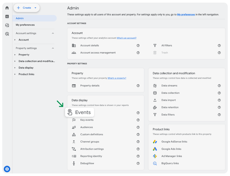
For some sites, that action is a form submission or booked call. For others, it is an email signup, a free trial, or a completed purchase. Google recommends defining important business actions as key events in GA4, and its GA4 documentation on key events is a good reference if you haven’t set them up yet.
This part of the dashboard forces clarity. It tells you what counts as success before you start reading the numbers.
5. Site-attributed revenue
Now connect the dashboard to money.
If you run a store, that means revenue. If you sell services, it may mean revenue from booked projects that originated through the site. In case you monetize content, it may mean affiliate income, subscriptions, or sponsorship revenue tied to your website.
A revenue number changes how you interpret everything else. A traffic source that brings fewer visitors may still be your best channel if it produces stronger orders or higher-value leads.
That is why your dashboard should keep revenue next to traffic rather than in a separate mental bucket. When the two move together, that usually means your site strategy is getting stronger.
Compare periods carefully, or the dashboard will mislead you
A dashboard becomes useful when you compare the right periods in the right way.
Many site owners make two common mistakes. First, they compare a short spike against a quiet week and assume they have found a trend. Second, they compare two values using the wrong math, resulting in an overstated change.
Here is a simpler way to stay honest.
Compare like with like whenever you can. Look at month-over-month, quarter-over-quarter, or the same season against the same season. A holiday store, a course creator, and a local service business all experience swings that can distort a quick read.
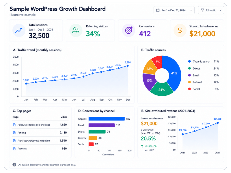
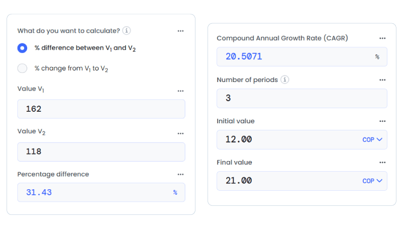
Then pick the right calculation for the question in front of you. To compare two parallel values without turning one into the official starting point, a percentage difference calculator is useful for things like channel shares, average order values across two segments, or the gap between mobile and desktop conversion rates. In the sample dashboard here, organic search drives 162 conversions and email drives 118. Percentage difference helps show the size of that gap without forcing one channel to act as the baseline.
When you want to measure how your site-attributed revenue has grown over several years, a CAGR calculator gives you a cleaner annualized view of financial growth than a simple total increase. In the revenue panel, site-attributed revenue rises from $12,000 in 2021 to $21,000 in 2024. CAGR shows the average yearly growth rate across that full period more clearly than a one-time percentage jump.
Traffic composition and revenue growth answer different questions, which means the math behind each should reflect that.
Review your dashboard on two schedules
A good dashboard supports decisions, not constant checking.
For most sites, a two-speed review schedule works best.
Weekly review:
- Look at top pages, traffic sources, and conversions.
- Flag sudden drops, broken pages, campaign spikes, or technical issues.
- Note any pages that attract attention but do not create action.
Monthly review:
- Review the returning-visitor share.
- Compare channel mix across a longer window.
- Track site-attributed revenue and average order value.
- Decide what to improve next: content, SEO, offers, product pages, or conversion paths.
The weekly view helps you catch problems quickly. The monthly view helps you see direction.
Keep the dashboard lean enough to guide action
The best dashboard is not the most detailed one. It is the one you will still use three months from now.
If you are building your first version, keep it lean:
- One traffic metric
- One loyalty metric
- One conversion metric
- One revenue metric
- A short source breakdown
- Your top pages
That setup already gives you enough to answer practical questions. Which channel brings the right visitors? Which pages earn attention but fail to convert? Is loyalty improving? Is revenue keeping pace with the work you put into the site?
Once your dashboard answers those questions clearly, you can add more detail. Until then, simpler usually wins.

A dashboard that truly connects you to your users
A WordPress growth dashboard should do more than prove that people visited your site.
It should show if the right people found you, if they trusted you enough to come back, and if your website created measurable business value. When you connect traffic, loyalty, and revenue in a single, clear view, your next decision becomes easier, and your strategy gets sharper with every metric you understand.
FAQ: Growing with EasyWP
The EasyWP Stats menu gives you a focused set of essentials, such as traffic sources, devices, countries, and top pages. You can quickly see which channels and pages deserve attention in your weekly review. Instead of bouncing between multiple dashboards, you can use EasyWP for fast checks, then rely on GA4 and your custom reports for deeper analysis of loyalty and revenue.
Because EasyWP handles WordPress performance and uptime for you, you can focus your dashboard on the business side, like qualified traffic, key actions, and site-attributed revenue. When you pair reliable hosting with clear metrics for conversions and revenue, it becomes much easier to see whether your content, offers, and campaigns are actually turning visits into business value.
Not necessarily. Even if you only start with EasyWP Stats plus a basic GA4 setup, you can still monitor core metrics like traffic sources, top pages, and key actions that feed into your growth dashboard. As your site grows, you can layer in more advanced tracking, but EasyWP already gives you enough visibility to connect traffic, loyalty, and revenue in a practical way.
More articles from us!
