UX Improvements for content-rich blogs to get more engagement


As a digital marketer, one of the most important goals is to create a seamless user experience for your clients’ customers. This is where UX improvements come into play. Whether it’s a website, an app, or any other digital platform, UX improvements can make all the difference in enhancing the overall user experience. With the ever-evolving digital landscape, it’s crucial to stay ahead of the curve and continue to enhance your clients’ digital presence.
Many WordPress themes still use “Lorem Ipsum” dummy text for previews and demos instead of actual content. They look good that way.
Once your website or blog becomes content-rich, new issues can appear!
Such issues haven’t been taken into account due to an upfront lack of real-life content examples. Yet you can still add UX improvements later. These changes typically result in increased engagement!
Your Blog is Live but It Looks…Different!
So your blog or website is finally live. Woohoo! The beautiful theme you have chosen looks somehow different though. How come? Let’s take a step back!
At first you don’t notice, really. Later you don’t realize what actually happened. Until one day it dawns on you—your actual content is much different from what you’ve seen in the demo theme!
Many websites or blogs start almost empty.
Once you add more content, you’ll notice the idealized version of the theme you saw at first might not reflect the actual reality.
Even when the demo website used real content, such as articles and images taken from free content websites, your actual articles and images usually differ quite a bit from the demo content.
UX improvements can be as simple as streamlining the navigation of a website or app, making it easier for users to find what they’re looking for. It can also include updating the design and layout of a website or app to make it more visually appealing and engaging. These changes can help keep users on the platform for longer periods of time, increasing the chances of conversion and return visits. Another important aspect of UX improvements is ensuring that the platform is mobile-friendly.
With the majority of users accessing the internet on their mobile devices, it’s crucial to optimize the platform for mobile use. This can include making sure the platform is responsive and easy to navigate on a smaller screen, as well as ensuring quick loading times. Overall, UX improvements are crucial in enhancing the user experience and ultimately driving conversions.
From Zero to Hero – The UX Can Reflect the Transition

When importing a large number of posts and pages, along with lots of images, you may immediately notice; however, when you add content gradually, like most new websites do, you may initially overlook any issues.
Sometimes you know right away that you don’t have a lot of content yet.
Then you use a theme that doesn’t emphasize the fact that you lack a large archive. All these situations can be tackled later, though.
Don’t just give up and use a theme where your content doesn’t really fit. It may be too short, too long or anything in between. Just adapt your theme down the road. Always try to improve and optimize the user experience (UX) especially once it’s clear how your content affects your layout.
In case you can’t customize themes or add widgets and plugins yourself, there are plenty of people willing to do it for you. These services are affordable as WordPress is very popular and the skills needed are widely available after 16+ years of existence.
The transition from zero content to a blogging superhero can be supported by a change in UX design.
You don’t have to keep the first look that was initially made for the budding blog.
First of all, you’ll need to acknowledge that form follows function. It’s easy to create a good-looking WordPress theme or blog design when you can change the content according to your wishes.
In reality, a theme needs to be able to accommodate different types of content. Short posts and long essays or lists of many items and posts with a variety of images are just some of the most common.
While your blog develops and grows over time, your UX
- can adapt
- reflect the changes
- and support the transition
You can go from an empty starter blog to a content-rich one with lots of engagement gradually.
It’s just like those superhero movies where the hero usually dresses up in a costume to have their appearance match their superpower. Sometimes the dress is also more than that, it provides protection or additional tools.
When your superpowers are hidden you can’t expect people to view you as a hero. Make sure to flaunt them!
Are Your Headlines Long Enough to Reach Your Audience?
New blogs also often need to have longer headlines. When you’re a “purple cow” like Seth Godin, you can use super short headlines. Sometimes they amount to a single word! In most other instances, they’re just two to five words, none of which are really optimized to work online. Why?
Having an immensely popular (personal) brand makes you immune against the requirements of modern technology. You can ignore the latest tech trends and keep on blogging like it was 20 years ago! (Yes, that’s how long Seth has been blogging.)
You don’t need to optimize for social media or search audiences once you have your own faithful audience that’s been established over the years. You have a large enough, regular audience of readers who diligently subscribe and read.
Attracting social media and search users either happens automatically because fans share already or it does not make a difference. Ranking for metaphors and one-word keywords such as [streaks] or [impossible] only leads to irrelevant traffic, anyway.
New blogs, in contrast, have to try to reach people from social media and search engines while not ostracizing existing readers. This is a difficult balancing act at times. You not only have to add matter-of-fact keywords for Google users but also sound intriguing for fickle social media audiences.
Your blog needs to support longer headlines to make sure all audiences are reached.
Instead of headlines such as “Streaks” or “Impossible” Seth Godin uses you are advised to write something like “Streak like a Freak – How to Form Habits for Long-Term Productivity” or “Working Smart: Getting ‘Mission Impossible’ Tasks Done.”
These headlines both work both for search engine and social media users they’re also long— 8 to 12 words instead of one! Ideally, you should be able to find some middle-ground. Headline length depends on context.
A headline formula for new blogs differs than one for a blog that has been around for a year or so. An established blog that has been thriving for years is also different. Not-yet popular blogs often use such a formula to get the attention of both search engine and social media users:
[number][exclamation][keyword 1][keyword 2] on [keyword 3] for [target audience]
For example:
27 Spectacular Modern Houses on Mountains for Young Families
While [modern houses] is still too competitive, [modern houses mountains] may work on Google in case your list is good enough to get some links or your website already has some architecture authority.
To pique interest, you have to stress that they are “spectacular” even though people rarely search for such an adjective, let alone the number of 27. The 27 makes people click because weird, large numbers actually draw bigger crowds.
A popular blog that either already ranks on Google or has a stable audience on social media can afford to shorten their headlines. Until then, too short of headlines are a recipe for obscurity because you can’t yet rank for competitive keywords and you can’t pique the interest of strangers without being very unique and specific.
Down the road you can optimize these headlines and even shorten them. First, we suggest looking up what they are already ranking for and then put your focus only on those that work or may work.
Are You Displaying the Most Important Content on Top?
Most WordPress themes display the latest articles right away, just like in the early blogging days. You can create a sticky post but that’s just it—one post on top that remains there as long as you like.
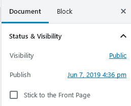
When you enter a post on the WordPress dashboard, you’ll see a little checkbox saying, “stick it to the homepage”—this allows you to add a particular article to the top of the page even though newer posts get published later. They will display below the “sticky” post instead.
What happens when you display the latest post on top of the homepage, even though it may be less relevant to first-time visitors? You risk “bounces” from casual visitors! People who are not planning to visit your website but drop in, more or less accidentally, to check it out move on quickly. What is the opposite of a bounce? Engagement! To succeed online you need it badly!
For first-time visitors, it’s often a good idea to create a widget with the most important, popular or must-read posts and display on the top or top-right sidebar.
As many blogs don’t have sidebars these days (which is a good design choice in general), your widget may appear at the bottom below the content. This is a bit too late.
On the WordPress dashboard, you’ll see an item called “Appearance” in the left-hand menu. From here, you have to choose “Widgets“. The easiest way to add a recommended content link is to simply use a plain “Text” widget:
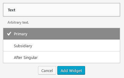
This is what you’ll see. “Primary” in this case means the widget below the search bar on the theme where this screenshot was taken on. Most themes that have a sidebar on the right will look similar.
Once you click “Add Widget,” you’ll get taken to another dialog that allows you to add actual text and display it on the sidebar below your internal search input. In this case, we’re not just adding text but also links to our recommended content. Fasten your seatbelts, folks!
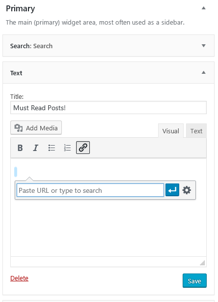
When you click on the link icon you can search for your WordPress content and add your favorite “must read posts.”
You can also learn your first HTML code unless you’ve tried it already. When you click the “text” tab (as you are in the “visual” tab of the widget now) the actual code behind the link will be shown to you. Make sure to add a link first to see how a link looks behind the scenes. In our case, it would be something like:
<a href=”https://www.easywp.com/blog/blogging-superheroes-wordpress-benefits“>Blogging Superheroes on WordPress Benefits</a>
Without a “most popular” or “recommended” selection, many visitors will check out the top post or posts (depending on how many are visible) and bounce based on those headlines unless one of them draws them in to stay and read.
A sticky post may also backfire because it appears as if the same post is the last post you published—even though more posts were published below it since. People who just check out the homepage may think nothing new has been added and bounce, never to return as the perceived posting frequency is too low to try again.
There are advanced tools that show the best-performing posts on top based on actual engagement metrics. This way the most commented, shared or visited posts get displayed on top.
This is a good solution although sometimes it also perpetuates the popularity of just a few selected posts while the rest of content gets forgotten. Make sure not only to rely on engagement metrics for showing content on top. Sometimes editorial decisions choosing the most important content are also helpful.
Some Topics Look Different than Others – Imagery Can Vary
Let’s be honest, there’s no such thing as boring content. What is boring for me might be exciting for you. On the other hand, there is a difference between content that is attractive visually by itself and content that is not easily visualized by itself.
Blogging is somewhere in between those two but it’s rather difficult to provide with visuals. When you blog about blogging itself, you’ll often have to come up with images from elsewhere that illustrate your point.
Are you blogging about highly-visual topics? Visually attractive subject matters are:
- Art
- Design
- Fashion
They’ll have lots of image content by itself. Theme demos often use such highly-visual content to make the blog design look more appealing. When you install it yourself, you’ll realize that your imagery might by far less cool than the fashion models, supercars or designer products you’ve seen.
You can do two things:
1) Provide images that somehow illustrate your point, be it in a metaphoric way
2) Provide screenshots or data visualizations
You can also deemphasize imagery in your theme to show headlines and body text more prominently instead. Sometimes it also helps to combine both by using appealing images such as a background for headlines or headline variations.
The actual written headline may be well-optimized, then, for search engines and their users while the text image headline might be more appealing to a social media sharing audience, think Instagram or Pinterest, and even work by itself without the broader context of the blog post.
In any case it might be a good idea to review your actual image usage and compare it to that of the themes you’re using. The design might fit a different type of content than you actually can publish. Trying to be something else, then, may result in a strange type of hybrid content.
In general, using photos (especially of people), are great to make people relate to your content but also are pretty big when shown in high quality. The image size is much smaller with customized illustrations that use symbolic expressions of the textual content. These are often unique but tend to be more corporate-looking and less appealing to the average viewer.
Negative Social Proof vs Call to Actions and Engagement Counts
Standard themes also often focus on:
- The number of comments
- The “first published” dates
- Author names and avatars
If you write evergreen content, don’t have an audience yet and you write alone on your single-author blog, seeing those features on top each post can do more harm than good.
When starting out a blog, you’ll most likely have zero comments so prominently displaying “zero comments” above each of your posts is understandably not recommended.
Once you have some popular articles that have been engaged with, it might be a good idea to show the comment counts on those posts.
To encourage engagement, the date has to be either very current or shown somewhere below for those who are only really looking for it. Showing a date suggests your content is already outdated, therefore decreasing engagement and resulting in a higher bounce rate.
Lack of visible engagement by others, as in “zero comments” or share counts that show a zero or very low number also lead to lower engagement. No one wants to comment on a blog that is so obscure nobody will see their comment. The same scenario applies to sharing.
No one wants to embarrass themselves by sharing something that has no apparent value because no one else has shared it yet. When you combine dates that display your blog has been online for weeks or months with a low engagement (zero comments, no shares) this is even worse.
Instead of a “zero comments” badge of shame, you should show a call to action such as “be the first to comment” or an even more generic one like “please comment,” “respond” or “add your thoughts here.”
One of the most common mistakes on blogs that have been around for awhile (think a year or longer) is the focus on dates. When you deal with breaking news, they make some sense but after a day or two, most of your content is considered “yesterday’s news.”
WordPress, by default, shows the “first published” date so an article that’s been updated recently will still show the original date from a year ago or earlier unless you republish it.
Most people don’t engage with outdated content. In case they read it at all, they often assume that the conversation on such an item is not active anymore so they won’t comment, like or share.
There are many ways to deal with this “outdated” problem. You can display a date below the actual post. You can hide the date from the homepage and only show it on posts. There it can appear below the content so that it’s not the first thing people see.
Another more advanced solution? To display the date a post has been updated on top of the content. There are even WordPress plugins to display the “last modified” date, like this one.
This is perfect for those blogs that mainly publish evergreen content, which routinely gets updated—instead of constantly churning out new content.
Many blogs are still publishing new content, almost on autopilot, as if it were always the best solution even though usually just a few large, popular, and relevant posts rank on Google and therefore over time receive a constant stream of visitors. Eve if it’s timeless by design, most content gets quickly forgotten.
This is why it’s a good idea to often take existing content, review it, edit it, and optimize the ones that need it. In the meantime, you can also update the articles that almost succeeded and keep the updated posts that already work well.
As a digital marketer, it’s important to stay up to date with the latest UX trends and continuously work to improve the digital presence of your clients. By implementing UX improvements, you can create a seamless and engaging user experience that will keep users coming back for more.
More articles from us!
