The essentials of building a responsive WordPress website


Your website’s ability to adapt across many devices, from desktop computers to smartphones, can make or break your online presence. In this guide, we’ll walk you through the essential steps of crafting a responsive website using WordPress. You’ll learn important tips to improve your website’s usability and functionality, from emphasizing the importance of responsive design to revealing the best WordPress responsive plugins.
Understanding responsive web design
The goal of responsive web design is to create websites that provide the best possible viewing experience across a variety of devices, with little scrolling, panning, and resizing required for easy reading and navigation. It indicates that the layout of your website will change according on the device’s screen size and orientation.

With the increasing number of web users accessing the internet using mobile devices, it’s critical to ensure that your website is mobile-friendly. In fact, Google has implemented mobile-first indexing, meaning it primarily uses the mobile version of content for indexing and ranking.
Why you should prioritize responsive design
Responsive design is vital for several reasons:
- Improved user experience (UX) — A responsive design ensures that your site visitors have a positive experience regardless of the device they use.
- Increased visibility on search engines – As mentioned earlier, Google now prioritizes mobile-friendly sites in its search results. Thus, having a responsive website can improve your search engine ranking.
- Reduced bounce rate – If your site isn’t mobile-friendly, visitors are likely to leave your site quickly, increasing your site’s bounce rate. A responsive design can help reduce this bounce rate.
- Simplicity and cost-effectiveness – A responsive design means you only need to manage and maintain one website, which is simpler and more cost-effective than managing separate sites for different devices.
Mobile-first design vs. responsive web design
It’s important to note that mobile-first and responsive web design are not the same. While a mobile-first site is responsive, a responsive site isn’t necessarily mobile-first. The critical difference lies in the approach to the design process. In a mobile-first approach, the designer first creates an optimal viewing experience for mobile devices and then expands its features for larger screens. Meanwhile, responsive design starts with a desktop site adapted to fit smaller screens.
Practical tips for creating a responsive WordPress site
Now that we understand what responsiveness is and why it’s crucial, let’s outline some practical tips on how to make a responsive website in WordPress:
Choose a responsive theme
When choosing a responsive theme for your WordPress website, prioritize options designed to adapt seamlessly across devices and screen sizes. Look for themes that are labeled as “mobile-responsive” and “cross-browser compatible” to ensure optimal performance and accessibility for all users.

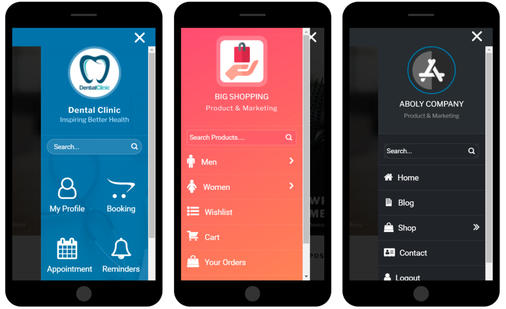
Simplify your navigation
Streamlining your website’s navigation is key to enhancing the user experience on all screen resolutions. Keep your menus concise and organized, prioritizing essential pages and categories to streamline navigation for both desktop and mobile users. Avoid cluttering your menu with unnecessary items, and consider implementing drop-down menus or hamburger menus for mobile devices to maximize space and usability.
Optimize images
Optimizing images is crucial to improving site load speed and enhancing user experience, particularly on mobile devices where data bandwidth may be limited. Ensure your images are appropriately sized and compressed to minimize load times without sacrificing image quality. Consider using a WordPress responsive plugin for image optimization, which can automate the process and optimize images for different devices and screen resolutions.

Use mobile-friendly forms
When incorporating forms into your website, prioritize mobile-friendly options to ensure a seamless user experience across all devices. Avoid using pop-up forms that take up the entire screen, as this can disrupt the user experience on mobile devices and lead to frustration. Instead, opt for responsive form designs that adapt to different screen sizes and orientations, making it easy for users to input information on any device.
Use CSS media queries
CSS media queries are a powerful tool for creating responsive designs that adapt to different device displays. By using media queries, you can apply different styles and layouts based on factors such as screen size, resolution, and orientation. This allows you to create a consistent and optimized user experience across various devices, from desktop computers to smartphones and tablets.
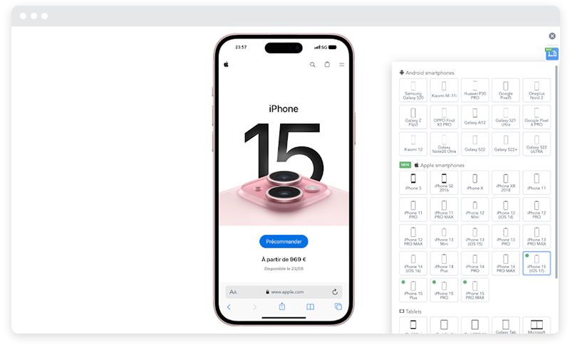
Test your site for responsiveness
Extensive testing guarantees that your website is fully responsive and works on a variety of devices and browsers. Test your website on a range of devices, including laptops, desktop computers, tablets, and smartphones, as well as well-known browsers like Google Chrome, Mozilla Firefox, and Safari, and complement this with structured website cross-browser testing to catch subtle layout or behavior differences between browsers. This will assist you in finding and fixing any design errors or compatibility problems so that your website offers a consistent user experience on all platforms.
Now that we’ve covered the basics and outlined some practical tips, let’s explore some of the best WordPress responsive plugins for optimizing your site.
Best responsive WordPress plugins
Plugins can significantly simplify the process of creating a responsive WordPress website. Here are some you might consider:

Jetpack
This plugin enhances the performance, security, and management of your WordPress site. It also includes features for mobile theme customization. In addition to enhancing performance, security, and management, Jetpack also offers tools for customizing mobile themes, ensuring a seamless experience across devices.
WPtouch
This plugin automatically adds a simple and elegant mobile theme for visitors accessing your site via mobile devices. Recommended by Google, WPTouch creates a version of your website that passes the Google Mobile test, which can protect your search rankings.

WP Responsive Menu
As the name suggests, this plugin allows you to create a responsive dropdown menu for your site. With WP Responsive Menu, you can quickly create a responsive dropdown menu in just a few clicks, optimizing navigation for users on all devices and screen sizes.

AMP for WP
This plugin adds support for the Accelerated Mobile Pages (AMP) Project, an open-source initiative that aims to improve the web for everyone. It supports themes and blocks built for Divi and Elementor, as well as standard Gutenberg.
Create a stellar experience for users everywhere
Creating a responsive website is essential for providing a stellar user experience for your site visitors. WordPress makes it easy to create a responsive website by providing responsive themes from the start. Prioritizing responsiveness not only benefits your site visitors but can also improve your site’s search engine rankings.
Don’t forget to leverage WordPress responsive plugins to ease your design process further. Ultimately, your goal should be to create a site that’s easy to navigate and looks great on all devices. To delve deeper into creating exceptional user experiences, don’t forget to explore our comprehensive article on harnessing the power of WordPress UX.
More articles from us!
A-Z guide to creating a single-page website that converts
How to optimize WordPress with local SEO
