Reboot My Site: Awe-inspiring website transformations
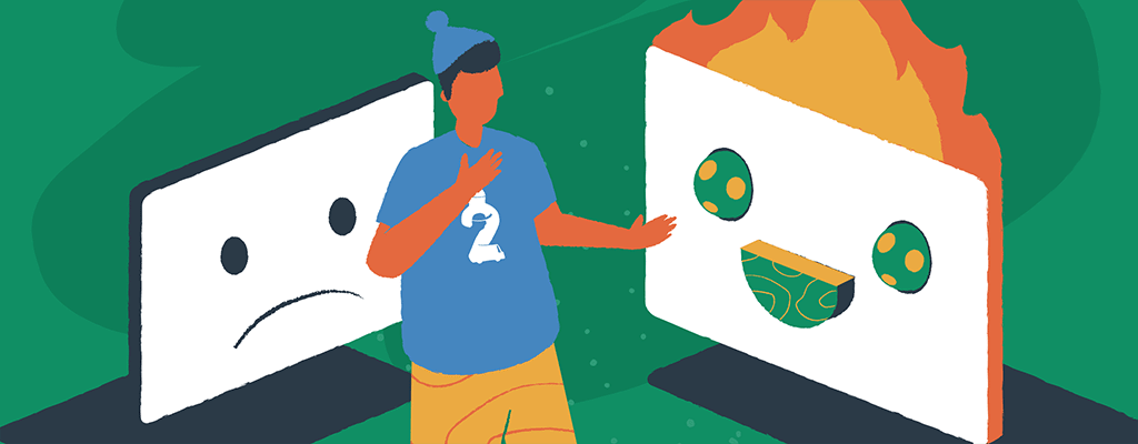

Have you ever been browsing the web and come across a website that was so breathtaking you couldn’t help but stop and admire it? Awe-inspiring website redesigns can be a powerful way to capture the attention of potential customers and draw them in. Whether you’re looking to revamp an outdated website or build something from scratch, complete website transformations can make all the difference.
With a careful combination of color, typography, and layout, you can create something that is both pleasing to the eye and easy to use. Redesigning, when done the right way, also helps to improve keyword relevancy and page loading times, which can help to boost user satisfaction as well as your search engine optimization (SEO) rankings.
To prove this point, let’s look at a before and after transformation of a website redesign completed through our Reboot My Site initiative. Together with our friends at Brizy, we’re helping small businesses revamp their old and outdated websites. As well asgiving them a fresh new look and feel, we’re helping them to conquer search rankings with strategic SEO techniques.
Identifying websites that need a redesign
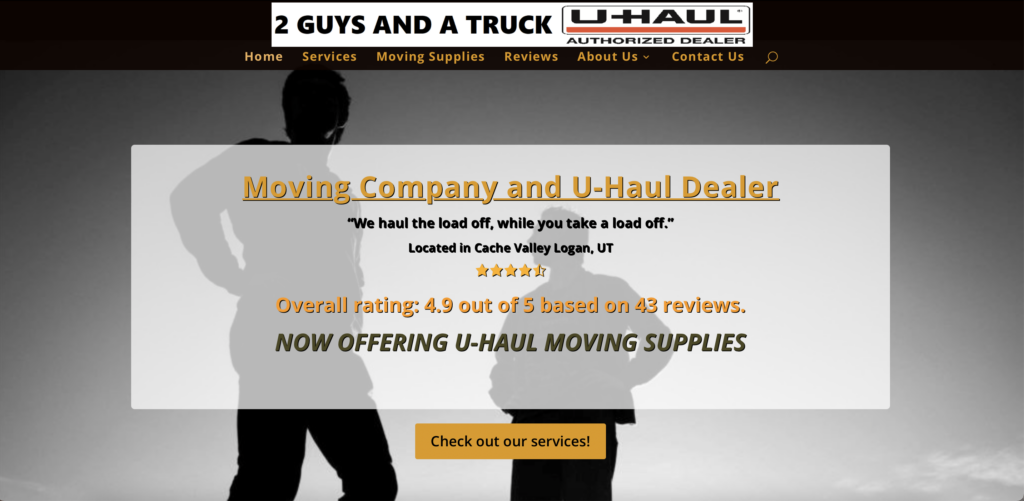
For the Reboot My Site project, we gave small businesses a chance to apply for a complete website transformations. The first website we selected belonged to 2 Guys and a Truck, a moving company in Cache Valley, Utah. Their site was redesigned using Namecheap Cloud-powered EasyWP, and Brizy, the best site builder for non-techies.
Before starting the redesign, it was essential for us to understand what the business owner, Aspen, needed from the new design, what he wanted to change, and what he wanted to leave untouched.
After a few meetings and plenty of brainstorming, here’s what our plan for the new website looked like:
- Keep the established domain name – twoguysandatruckllc.com
- Retain the recognizable brand colors – orange and gray
- Continue the idea behind the logo but bring it up-to-date
- Redesign everything else
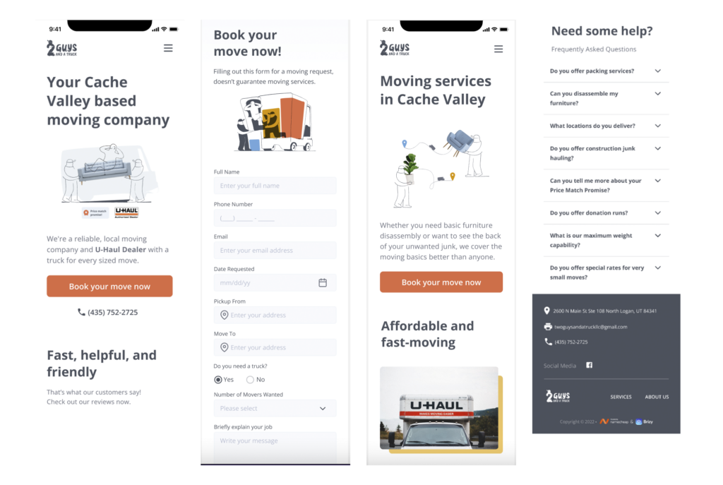
The homepage needed a better value proposition so visitors could see exactly what the company does at first glance. A new hero image and an upgraded reviews section would give the website design a dramatic new vibe. There was also a need for a new call-to-action (CTA) button that would lead to a better booking page.
Steps to website redesign
2 Guys and a Truck is a family-run business that’s been making a name for itself in the local community as being fast, helpful, and friendly. But while this U-Haul authorized dealer was gaining excellent 5-star reviews online, its outdated website desperately needed a revamp to gain more customers.
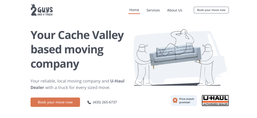
In today’s online world, simplicity is critical. In the new design, we condensed everything into three web pages — Home, Services, and About, and removed any unnecessary clutter.

As one of the moving company’s most vital assets, we moved customer reviews to the homepage to showcase trust. And to ensure people could easily enquire about booking a move, we strategically placed the “Book your move now” buttons in various locations. Plus, contacting 2 Guys and a Truck was now more straightforward, with email, location, and contact telephone conveniently placed in the page footer.
Examples of impressive website redesign
They say a picture says a thousand words, and that statement is no more evident than in logos. The old 2 Guys and a Truck logo was hand drawn by the owner’s brother and depicted two guys loading a sofa into a truck while a customer relaxed on top. Our design team modernized the style while keeping the main characteristics of the previous logo.
We retained the primary brand colors associated with the old site — orange and gray — and supplemented these with secondary colors, such as yellow and blue, for illustrations and backgrounds.
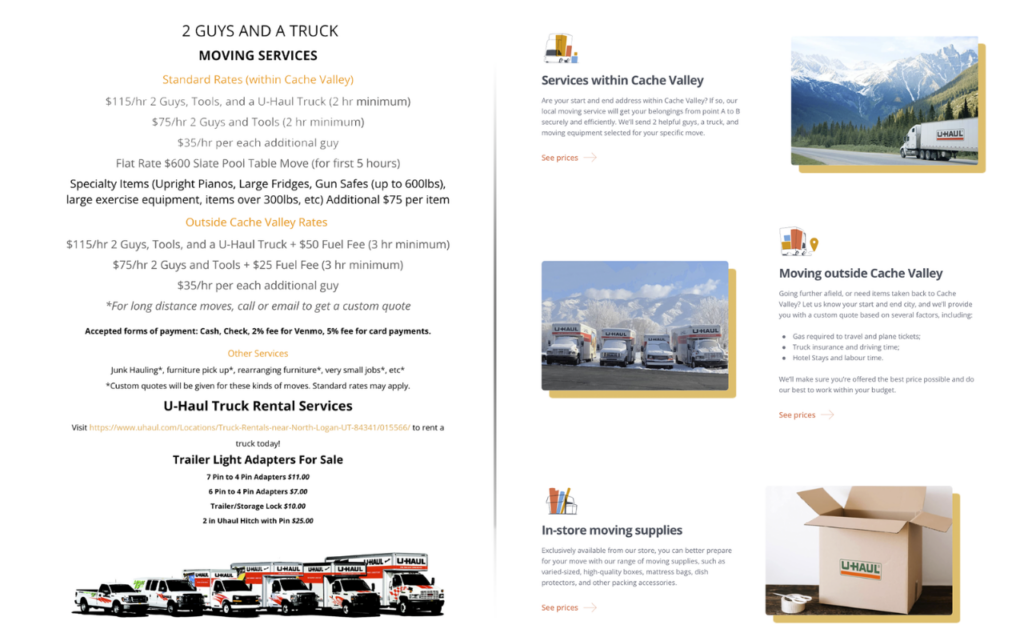
Instead of the poorly formatted and unorganized list on the Services page, we divided the services into five logical categories. This reorganization made it more evident to potential customers what the local moving company offers, and linked to descriptions of each service with simplified pricing information.
We completely overhauled the About page. The text was replaced with imagery that established a human connection. We also reminded customers that 2 Guys and a Truck was an authorized U-Haul Dealer and offered a “Price Match Promise.” The association with a well-known and reputable brand like U-haul was important for Two Guys and a Truck.
Cloud-based WordPress hosting & design tools to the rescue
Designers used the powerful and fast Brizy website builder to work the magic. Blocks, as they’re known in Brizy, help organize each page section.
We picked an ideal block for the header and worked from there. Our designers carefully adjusted the sizes and colors and added the logo and menu buttons. Then, like building a house, we added new blocks one by one as we started crafting a new home for 2 Guys and a Truck.
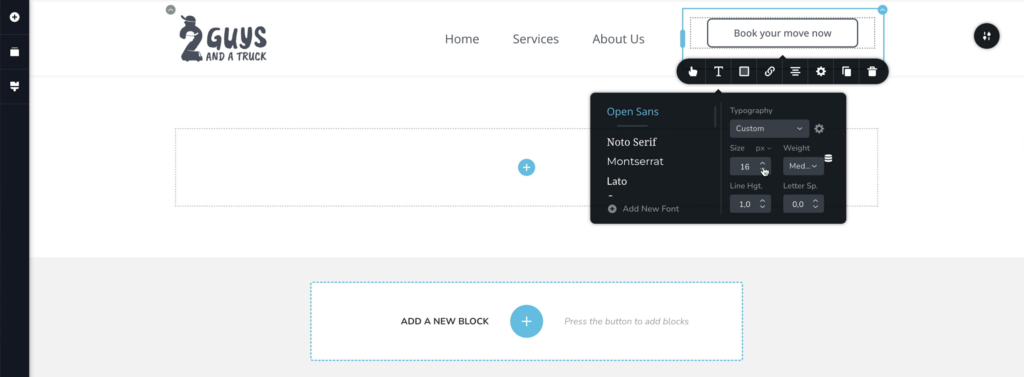
Our team worked to revamp the customer review section — an integral selling point for the business. They needed to be prominent and dynamic, so we opted for a carousel design on the homepage. Brizy’s predefined blocks and templates made this a breeze — we didn’t even need to write a single line of code.
Layouts could be easily customized in just a few clicks, and the fantastic, tailor-made illustrations we designed for Two Guys and a Truck were starting to take shape.
We knew most customers would be viewing the website via mobile devices, so it was crucial to build a responsive and polished mobile version. Luckily, Brizy’s responsive Mobile Columns made viewing and adjusting elements straightforward.
Tips for an effective website redesign
Redesigning a website can be intimidating, but with proper preparation and strategy, it can be a successful endeavor.
Brainstorm ideas: Before starting any website redesign, it’s important to brainstorm ideas about how you want your website to look and feel. Consider what kind of images, fonts, and colors you’d like to incorporate, and think about how you want the overall user experience.
Research & evaluate: Once you have ideas for your website redesign, take some time to research existing sites and evaluate their features. This planning will help you understand what works and what doesn’t and can help you better incorporate elements into your website.
Test & keep updating: It’s essential to test your website regularly and make new changes where necessary. This practice will help you identify any issues quickly and make necessary changes. Remember to ask for feedback from your users, as this can help you better understand your website’s performance.
The long-term benefits of a website redesign
A website redesign like this one from the Reboot My Site project can drastically improve sales. It provides a better user experience, increases the website’s visibility, and even makes it more efficient. With a well-designed website, customers will be more inclined to linger, explore, and purchase from your website. By following this example, you can easily redesign your website with little-to-no extra cost and a lot of creativity.
More articles from us!
